Visualize Results
In this page, we demonstrate how to visualize assignment accuracy and membership probability results using box plots and stacked bar plots.
Create a box plot for assignment accuracy
After the assignment accuracy of Monte-Carlo cross-validation results is calculated (using accuracy.MC), we can use the following function to create a box plot to visualize the assignment accuracy.
# accuMC is the object (a data frame) returned from the function accuracy.MC()
accuracy.plot(accuMC, pop = "all")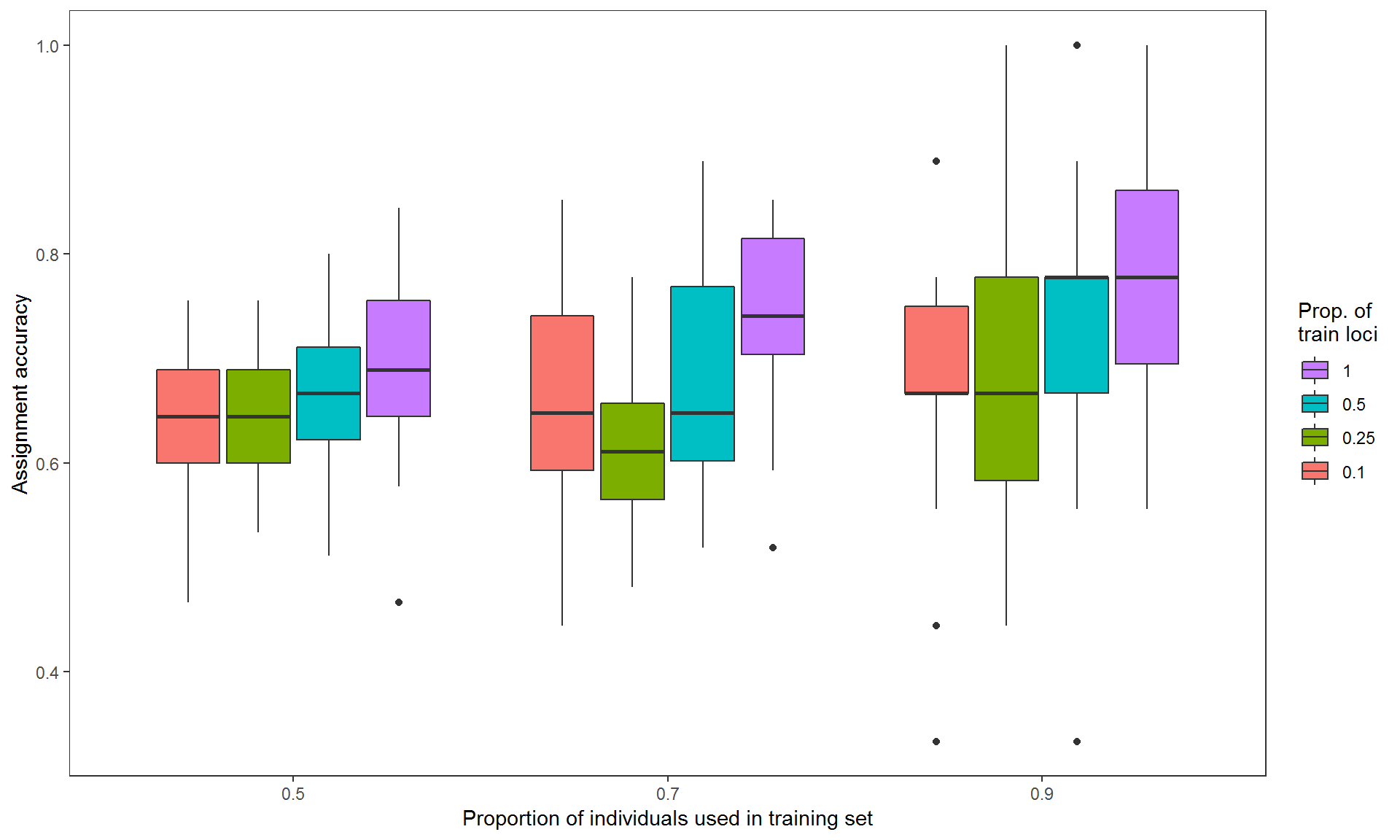
Figure 1. Assignment accuracies estimated via Monte-Carlo cross-validation, with three levels of training individuals (50%, 70% and 90% of individuals from each population, on x-axis) crossed by four levels of training loci (top 10%, 25% and 50% highest Fst loci and all loci in color-coded boxes) by 30 resampling events.
The argument pop is used to specify which populations to be included in the plot. Multiple populations can be specified (e.g., pop=c("pop_A,"pop_B","pop_C")) to create a faceted plot. If pop is not specified, assignment accuracy of overall populations (pop="all") will be used by default.
The function accuracy.plot() is built based on the ggplot2 library, so the plot can be modified using ggplot2. Below we made another plot that includes the assignment accuracy results of overall and individual populations. We also adjusted its y-axis limits (ylim), drew a horizontal line (annotate), added a plot title (ggtitle).
library(ggplot2)
accuracy.plot(accuMC, pop=c("all", "pop_A", "pop_B", "pop_C")) +
  ylim(0, 1) + #Set y limit between 0 and 1
  annotate("segment",x=0.4,xend=3.6,y=0.33,yend=0.33,colour="red",size=1) + #Add a red horizontal line at y = 0.33 (null assignment rate for 3 populations)
  ggtitle("Monte-Carlo cross-validation using genetic loci")+ #Add a plot title
  theme(plot.title = element_text(size=20, face="bold")) #Edit plot title text size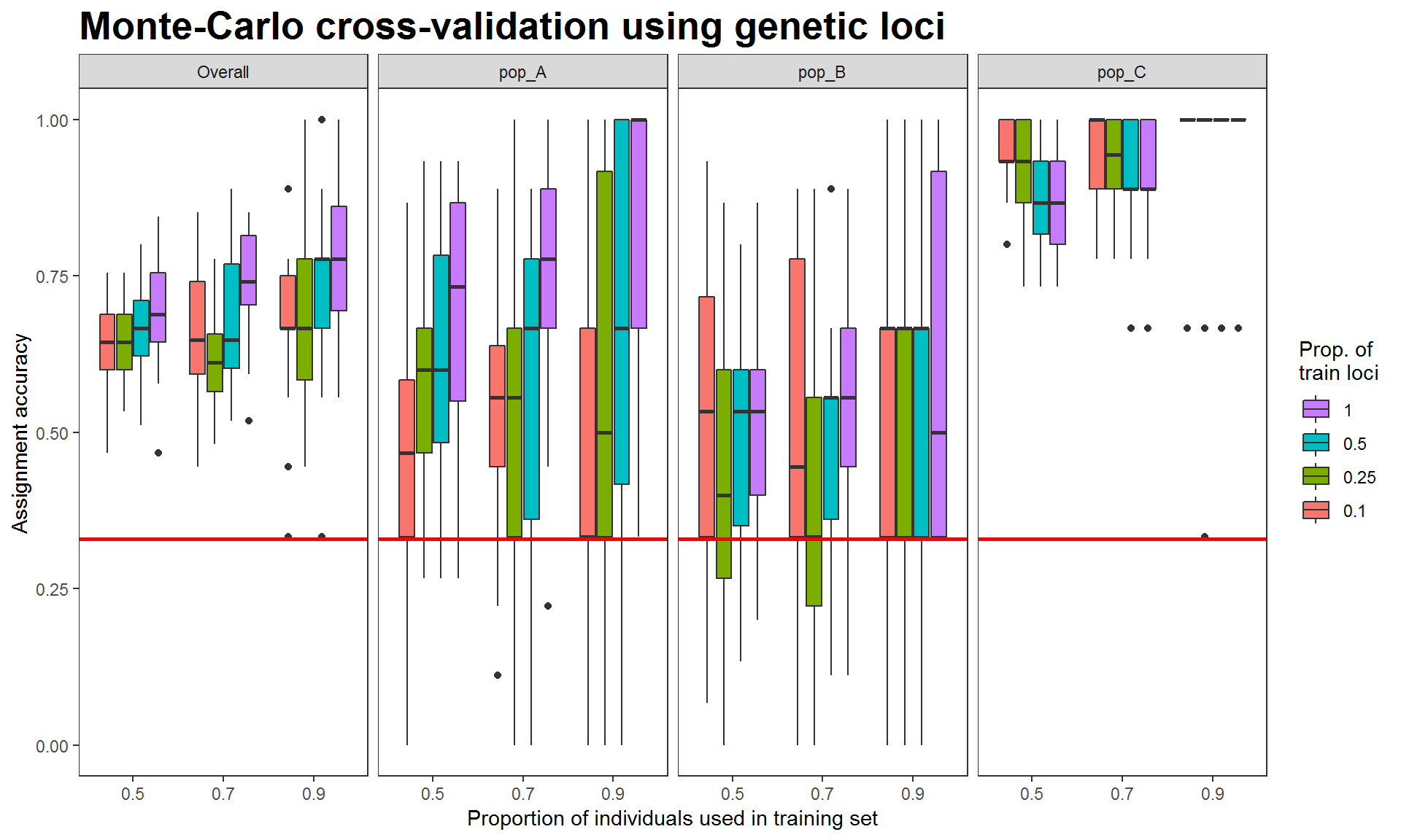
Figure 2. Assignment accuracies estimated via Monte-Carlo cross-validation, with genetic data (693 SNP loci) for three hypothetical populations of 30 individuals. Red horizontal lines indicate 0.33 null assignment rate.
The above results were estimated from the genetic data (simulated 1000 SNPs). Assignment accuracies of populations A and B are relatively low whereas those of population C are high, indicating that the genetic data could be used to distinguish between population C and population A or B.
Next, we created the assignment accuracy plot for the integrated data (genetics plus morphometrics, the object comin returned from compile.data). We skip the codes and show the results below.
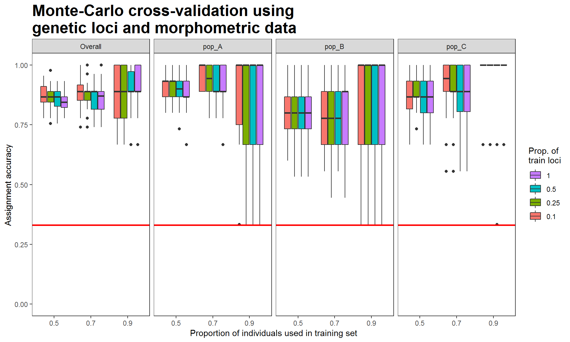
Figure 3. Assignment accuracies estimated via Monte-Carlo cross-validation, using genetic and morphometric data. Each box is the results of using a proportion of training loci plus 4 morphometric variables
When using the genetic-morphometric data, the assignment accuracies of populations A and B increased and that of population C remained high, resulting in increasing overall assignment accuracy. These results demonstrate the potential of using multiple data types to improve assignment success. Additionally, we can use the same analytical methods (i.e., Monte-Carlo cross-validation with the same proportions of training individuals, iterations, and classifier) to evaluate the discriminatory power of morphometric data.
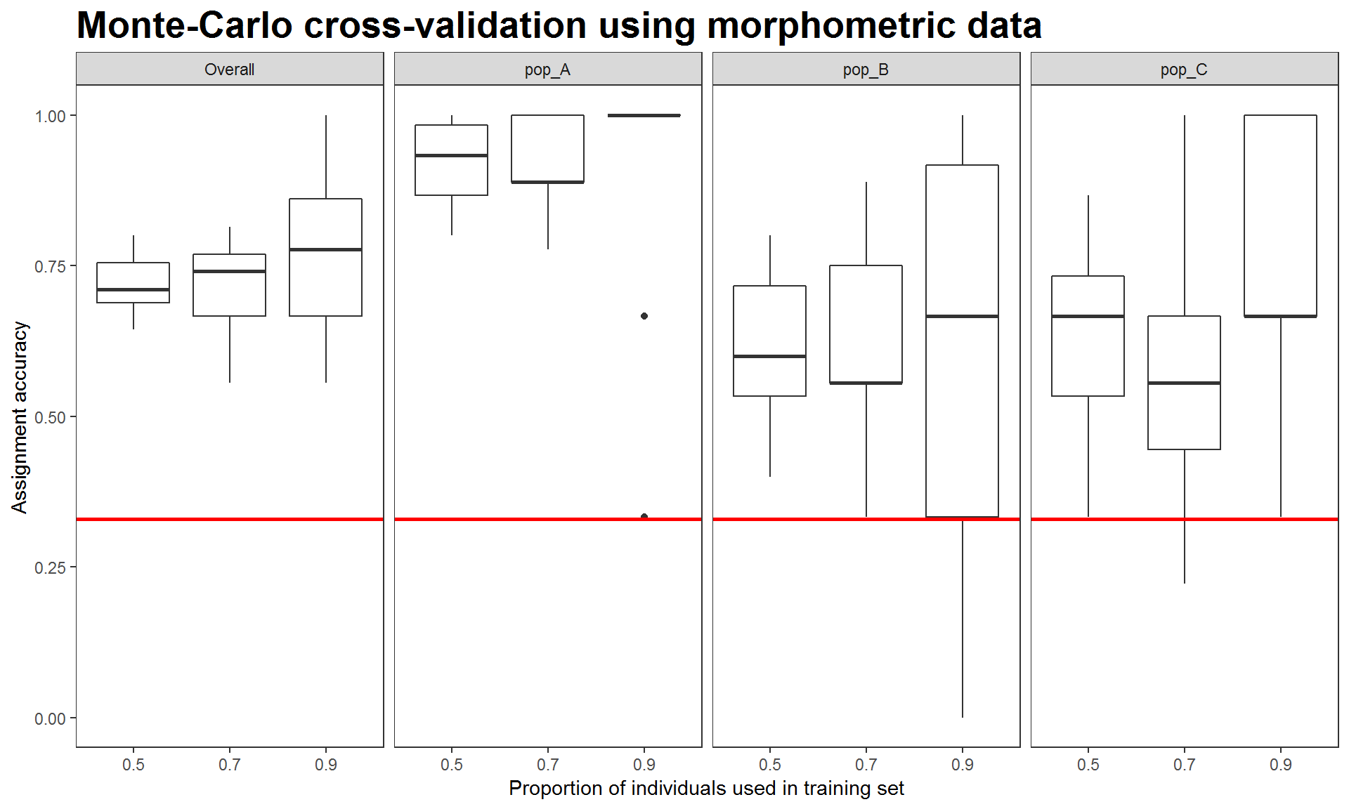
Figure 4. Assignment accuracies estimated via Monte-Carlo cross-validation, using four morphometric measurements.
The above results indicate that morphometric data helps distinguish population A from the other two. Therefore, it is expected that using integrated data would best discriminate among the three populations (Figure 3) despite that fact that using genetics or morphometrics alone was unable to distinguish population B from the other two (see population B in Figure 2 and 4).
Create a membership probability plot
In addition to estimating assignment accuracy, we can use probabilities to understand how individuals are assigned to the populations. To visualize membership probability, we use the results from K-fold cross-validation and create a stacked bar plot, like the STRUCTURE plot) that is commonly used in molecular biology papers.
# The folder 'Result-folder2' contains the results generated from K-fold cross-validation
membership.plot(dir = "Result-folder2/")
After entering the above function, it will prompt a few questions and allow you to choose which data set (results estimated from which combination of training data) and plot style to be used. The interactive conversation is shown as follows.
The first question is to choose the results from which fold.
## K = 3  4  5  are found.
## Please enter one of the K numbers: (You will enter your answer here)
The second question is to choose the results from which level of training loci (if data include genetic loci).
## 4 levels of training loci are found.
## Levels[train.loci]: 0.1  0.25  0.5  1
## Please enter one of the levels: (You will enter your answer here)
Lastly, if you didn’t specify the output style (e.g., style = 1) in membership.plot(), then it will print the following message and ask you to choose an output style.
## Finally, select one of the output styles.
## [1] Random order (Individuals on x-axis are in random order)
## [2] Sorted by probability (Individuals are sorted by probabilities within each group)
## [3] Separated by fold (Individuals of different folds are in separate plots)
## [4] Separated and Sorted (Individuals are separated by fold and sorted by probability)
## Please enter 1, 2, 3, or 4: (You will enter your answer here)
Below we use the results of 3-fold and all loci (train.loci = 1) to demonstrate membership probability plots, with four different output styles.
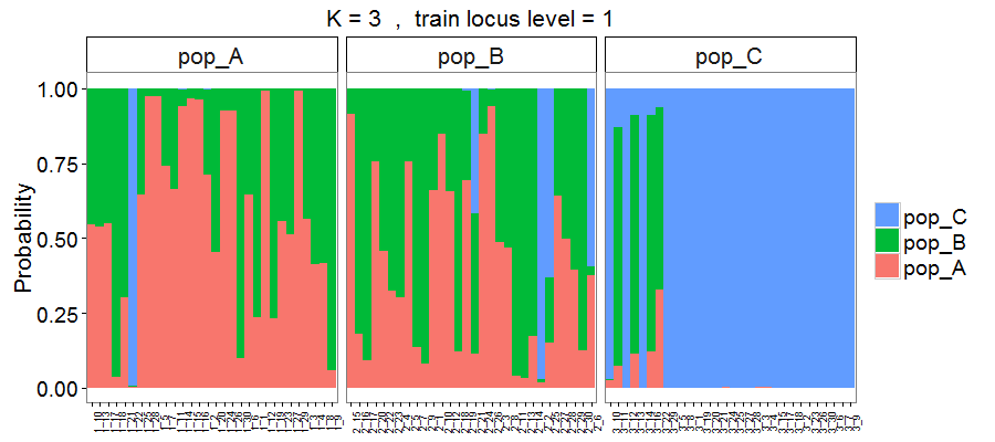
Figure 5. Membership probability of three hypothetical populations, with results estimated via 3-fold cross-validation using overall loci (693 SNPs). Output style = 1.
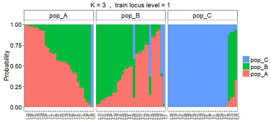
Figure 6. Output style = 2. Individuals are sorted based on the probability of assignment to their original populations.
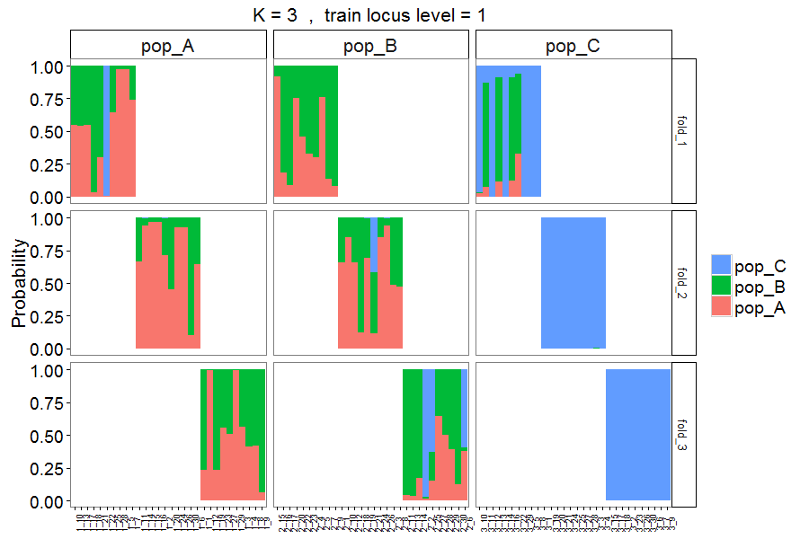
Figure 7. Output style = 3. Similar to Figure 5, but with individuals assigned to different folds in separate panels.
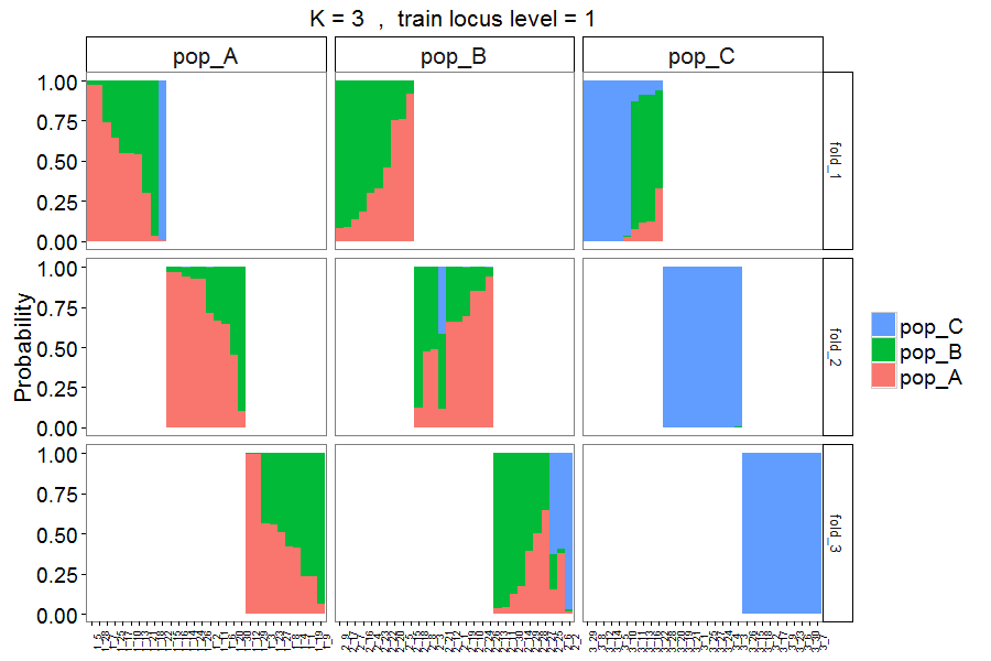
Figure 8. Output style = 4. Similar to Figure 7, but with individuals sorted based on probability of assignment to their original populations.
The above Figures 5 to 8 are the results from the genetic data. Here we also created the membership probability plot of results estimated from the integrated data.
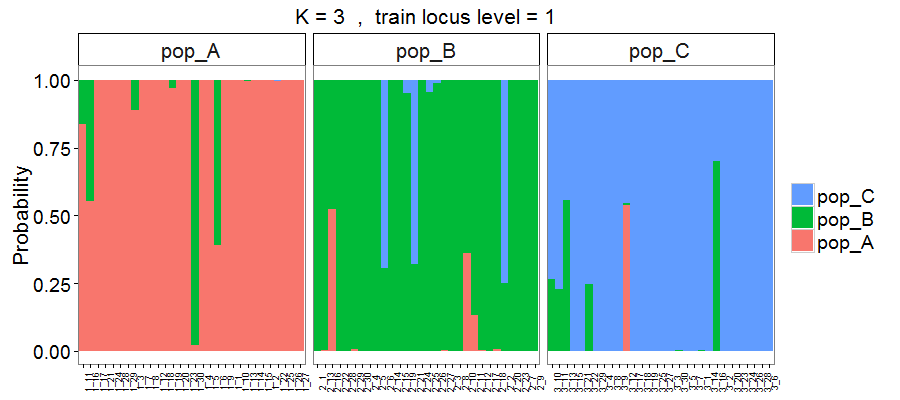
Figure 9. Membership probability of three hypothetical populations, with results estimated based on 693 loci plus 4 morphometric measurements.
As expected, using the integrated data allowed more individuals to be correctly assigned to the populations, particularly in populations A and B (see differences between Figure 5 or 6 vs. 9).
Print mean and standard deviation across assignment tests
To check how test individuals from each population assigned to its own and other populations, users can use the following function to print mean and standard deviation of assignment results across Monte-Carlo or K-fold cross-validation tests in R console.
#Default setting reads through all the files in the specified result folder
assign.matrix( dir="Result-folder/")

#Users also can specify certain results for printing the assignment matrix
assign.matrix( dir="Result-folder/", train.inds=c(0.7, 0.9), train.loci=c(0.5, 1))
Once the function was executed, it will print two tables in your R console. One is the means of assignment results across the tests; the other is the corresponding standard deviations. An example of assign.matrix(dir="Result-folder/") is shown below.
## Assignment across 360 tests from Monte-Carlo cross-validation
##  Mean
##          assignment
## origin   pop_A pop_B pop_C
##   pop_A   0.57  0.43  0.01
##   pop_B   0.42  0.48  0.10
##   pop_C   0.02  0.06  0.92
##
##  Standard Deviation
##          assignment
## origin   pop_A pop_B pop_C
##   pop_A   0.24  0.24  0.02
##   pop_B   0.25  0.25  0.12
##   pop_C   0.06  0.11  0.13